The Egretta Scarf: Process From Digital Design to Screen Print
- Megan Ciraolo
- Aug 11, 2020
- 4 min read
Updated: Aug 17, 2020
The egret.
I grew up with this elegant bird as a fixation. My mom would take us on birding trips to different natural environments in our local area. None were as beautiful to me as the wetland environment. I'd watch the egrets and herons wade in the water. They barely moved a muscle then would suddenly lift off into the air if someone got too close. Talk about elegance...the movement of their wings, the effortless pull into the air.
The 2018 to 2019 school year, my junior year in college, is when I started to incorporate more animals as motifs in my print and pattern work. I saw them as "personal symbols". Each one intrigued me and most of them related to ideas/experiences/feelings I had growing up.

In Winter 2019, I took the Advanced Screen Printing course at school. Our final for this class: silk scarves screen printed with reactive dyes. I was so excited for this one; it was one of the biggest reasons I took the class in the first place. At the time I had a growing interest in scarf design, seeing it as one of the few ways I could create surface design work that focused on one whole composition rather than a repeating unit.
As someone who loves border design, I went right to sketching ideas for that first with the theme of Ancient Roman gladiators in mind. Then I had the, admittedly, random idea to somehow place an egret in there too, so I also sketched that out (pictured to the left).
My professor didn't like my lack of well-thought-out concept. Now that I look back on it, I see the beginnings of ideas that would eventually go into my senior thesis, but they definitely weren't up to par yet, especially by my professor's standards. So all those sketches I had done before were scrapped and I moved onto a different concept and a completely different design which, in the end, I wasn't so happy with. I missed the mark with what I was trying to say because, while I had passion for the subject, my passion wasn't in the design.
I felt like I missed my opportunity to create something really beautiful and personal to myself. And so, when the quarter ended and I had some free time on my hands, I put together a new design with my drawing of the egret in the center, a border design from a page in my grid sketchbook, and some other old sketches.

Flash-forward to this past Winter Quarter in the Senior Studio II class, I finally found time to get to screen printing this design! The assignment was to go back and redo a past project, so I choose this one.
I started fidgeting with the colors a bit to bring down the color count and to make sure the overprints made sense first. As I was doing that I decided to tweak the design a bit as well.

In the previous design, the egret didn't stretch across the square enough and it wasn't as attention-commanding as I wanted it to be.
To fix this, I found a different reference picture, redrew the bird in pencil, and made sure to hype up the contrast when coloring it.
When recoloring the rest of the design, I made a point to use white sparingly, so that most of it would be in the egret itself. I also added more of the dark green to the border to make sure that color was spread across the design more. The rest of the redesign was just rearranging the leaves to fit with the new egret.
And with the final digital design, comes the beginning of the actual screen printing process (a.k.a. the really fun part)!

First, color testing.
In order to color test, especially when testing dyes, you need to test print on the fabric that you will be using in the final product, so I pinned my two different fabrics (Silk Crepe and Silk Twill) to the table. Each rectangle you see on the fabric (in the picture to the left) is a color test print. I'd do one of these on each fabric each time I mixed a color, making sure to also test the overprints. Once I got the colors I wanted, the fabric goes in the steamer for about 30-45 minutes to set the dye, and is then washed with a certain soap solution and water. Because of this, the colors slightly change a bit so the next step is to look them over a bit to see what colors you want to tweak. The greens I had the most trouble with here so I ended up doing another round of color testing.
The next step is getting the design onto the screens. To do this you need to first separate each color on photoshop (making sure to also include the overprints), then fill it with black. Below on the left is a picture of the four color separations that get printed onto film to then expose to four screens using a light sensitive chemical called emulsion and a light table. The picture on the right shows a section of one of the screens after it was exposed.
The areas with the pinkish-purple color are where the emulsion is. The emulsion blocks the dye from getting to those areas when the dye is pulled across the screen. The areas without it are where the color goes through.
Above to the left is a picture of the middle of the printing process. Two colors had already been printed and two had not been printed yet. Above to the right, are those scarves when all colors were printed, about to be rolled up and put into the steamer.
After this the excess fabric is cut then the edges finished with a hand rolled hem.
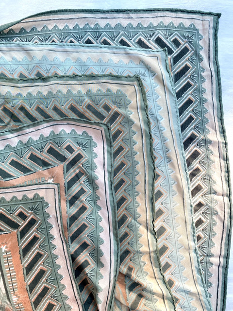
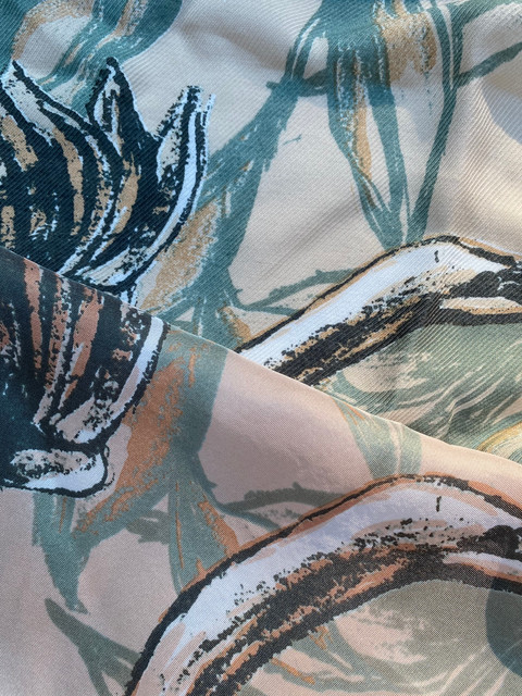
I ended up printing five scarves in total: two on silk twill, two on silk crepe, and one on silk rayon twill I had extra of. The variations in color (in the pictures below), are due to slight differences in dye mixing between the first time I printed and the second, as well as the difference in fabric (as different materials take dyes differently).
And that's it! The full story.
This was the first project I got the chance to go back, redo, and to actually make the product I designed digitally, and it was so satisfying. Hopefully I'll be able to do this again at some point.
To see the full finished design, click here.









Comentários